
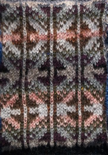
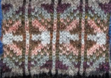
The next two photos show each of the two individual variations separately, to help clarify what I'm talking about!
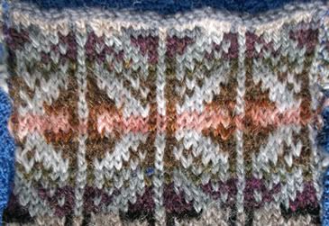
In the top photo, there is more pink.
In the second photo, I swapped the pink and palest grey, and reduced to pink to two rows in the center, rather than 4. The other lighter value yarns that form the back ground had to change their relative sizes to work out. The second version uses four rows of the lighter brown, in the center with the pink. V.1 has only two rows of the lighter brown.
At the bottom and top of each repeat, I changed my mind twice. First, I had black only in the two rows that begin the repeat. I decided to use four rows, thus edging the dark purple triangles. But the black looks too dark in person, so I thought about finding a dark grey. At the end of V.2 I subbed in the darkest grey I had on hand, which isn't dark enough.
Feedback appreciated! Owen already proclaimed the whole set of colors ugly. But he's an 11 year old boy, so I'm not giving too much credence to his opinion. He hates all the pink.
What I'm leaning toward is buying a very dark grey or brown to replace the black next to the dark purple. I also have on hand a dark blue which has a lot grey to it, which might do something interesting to the whole thing. Next, possibly buying a muddier pink (or giving some of mine a bath in tea or tan dye), to sub for the pink I have. Otherwise, I'm happy with the purple and loden on shades of grey. This project will be a vest for me, knit in the round with steeks at front and armholes. Corrugated ribbing all around. Pretty traditional in style and shape.
Weigh in with an opinion. If you only ever like jewel tones or primaries, obviously this isn't going to be a design you will like. Given that I love muddy tertiary colors, I'm interested in hearing what you think of these choices and their placements.
Thanks in advance!
16 comments:
Hmmm. Blogger just ate my first attempt at a comment. I'll try again. I love the top swatch with more pink. I also like the black. If you go for grey...maybe a really charcol grey? It would really make the pink pop. I agree the pink needs to be a bit muddier, but not too much. It's the brightness brings out the depth in the pattern. Any way you do it, it's bound to be gorgeous!
I think there is a problem with the pink. With fewer pink the effect is a bit like a stain to me. The pink is your only really warm organic color in there -- the rest are more mineral-earthy colors, you might consider moving to a more raspberry-kind of pruple to make the pink feel welcome in there and not stand out as much?
just my 2 cts, but then, I would never knit with those colors for myself-- as they don't complement my coloring. But I like fuddling around with colors for other people -- changes from my usual light blues, pinks, greys.
Honestly, I think I'd go with the variation with less pink, then take the pink and switch it out to a lavendar.
But, that said, I still really like the variation with less pink as is! I think I'd just prefer a lavender to go with the dark purple....or a sage green....
Just looking at the one with more pink, I initially think "Green Bay Packer Logo".....though I can't pinpoint why that is. And so, I like the version having less pink. I've never been very good at selecting colors myself..... I like the darkness of the black, though agree that a dark gray might work beter. And, I liked the suggestion to make the purple more of a lavender...but again, I want to stipulate that I am, indeed, quite color challenged!
In any case, it takes patience which I'm not sure I have right now in order to iterate through design ideas like this! I think it looks really nice so far!
Well....since you asked...I'd ditch the pink altogether if it were mine. But keep in mind that my entire wardrobe consists of denim, brown, green and gray so I'm probably not the best person to ask:-)
Steeks yippee!
I like the section with more pink better. But then again, I like pink. Pink! :)
Those of you who don't like any pink, try thinking about a late afternoon sunset in late November, through the bare trees in the NH woods. The sky is invariably grey and cold, looking like snow soon, but you get a diffuse glow at sunset through the trees.
Thanks for all the feedback so far. Not really a consensus, is there?
Apparently Karen and I are the only ones digging the pink!
Honestly, I like it. It gives the pattern a nice unexpected contrast. And this is going to sound nuts, but I think you ought to keep BOTH swatch patterns thru out the whole vest. When you do only top swatch--you'll get a horizontal strip effect won't you? (I'm not a big fan of the horizonal striping!) But I really love the way it looks using *both* ways with the pink. (when I take my glasses off and look at it the colors are lovely!)
As for the purple and black--they seem to be very similar and not very discernable to my eye. I'd say go with a lighter purple.
i really like the first/more pink one. I don't know...it just really pops at me, and i like the fair isle design. i do think switching out the black would tie it together better. frankly, both colour options work, but i'm somehow drawn to the more pink.
I'm liking the one with more pink in it. The second one does kind of look like it is stained. The pink looks very jarring. In the first swatch is more flowing and smooth. I have to admit though that when I went back and looked, it does look like the Packer's logo. hehehehe
Wow, the opinions are all over the board on this one! Thanks everyone.
Just to further complicate matters, today at the thrift shop I bought an oatmeal colored shetland wool sweater to frog. I have the skein from one sleeve drying on the line in the basement right now. So maybe oatmeal will work?
In general with complex colorwork, I find I like the results better when one of the colors fights the others a bit. Not an outright clash, but not quite textbook "this color goes with that" either. That's why sometimes I find it hard to tell by looking at skeins what will or won't work.
I've had some yarns that looked terrific together in balls or skeins and boring as can be when knitted together in a complex stranded pattern. Nothing like trying it all out.
The first thing I noticed was the pink. I really thought that made the pattern stand out. So I will have to say the first one.
You are so talented with design and color!
Ruinwen
:)
It's funny, I didn't know whether to post first, then read the others comments, or read first. I read first - and everyone seems to be talking about the one with more or less pink - whereas I'm seeing the Placement of the pink as the thing.
The diamond with the bar of pink across it is somehow jarring to me. It looks like the television set back in the days when you would get these horizontal lines running across the picture, they didn't belong there.
Whereas the diamond with the pink in the rings looks like a pool that you dropped the pebble in, where everything is harmonious and the colors radiate outward. Even though the lightest grey/oatmeal, whatever that color is, is also horizontal, it spreads out on the edges via the posts at the sides, and then the values deepen from there.
I like the pink in the combination, and I like your analogy of the late day light. You need that something in there to pick it up. But I like it best when it fits as a part of the whole, and not looking as if it is sitting on top.
crap, I just left a long and involved comment and blogger ate it. I'll have to write it later.
I like the bottom one better because I think the light blue blends in more. I don't really like the pink, it's not subtle enough for my eye, and I'm usually a pink person. I do like the idea of subbing the oatmeal for the pink.
Great design though, good luck!
I have a Plan C worked out in my mind. Tomorrow I'm going to Lakeside for coffee with a friend and while I'm there I'll look for a suitable very-dark-but-not-black yarn. Then I'll post a swatch with my newly muddied pink and take out the palest grey and sub in a warmer oatmeal color.
Stay tuned.
Post a Comment