Mr. SABLE is out in the glorious October sunshine putting bricks in another section of the path. After the initial section was done he let the whole project sit for a while. Nothing like the crisp fall weather to put the fear of impending winter in you and get you moving on the outdoor projects while you still have the chance.
More About Color
I dug out a few of my early swatches to show you some of what I learned by doing.

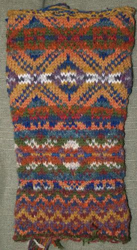
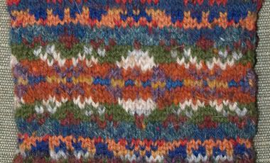
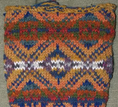
This is a tube of knitting I made in about 1990 or 91. At the bottom, I started with some simple zig zags. Then I tried to follow a chart from Starmore's Fair Isle Knitting, but substituting colors with almost no regard for logic. After one completely unreadable repeat, I switched to bigger needles and sorted my yarns by color family and value. Here are closer views of the two sections of that experiment:

Totally unreadable version

Much improved version. I still wasn't happy enough with that arrangement to make a whole sweater with it, but I felt like I learned something valuable.

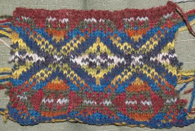
Here is another attempt at the same chart. This time I sorted by warms and cools. The fact that I really didn't consider the importance of value is very clear. Sometimes in traditional Fair Isle knitting the foreground and background intentionally shift values. In this example, they were each shifting from dark to light and light to dark in oppostion with each other, leading to an unreadable design.
By the way, another great book for learning about this stuff and fairly easy to obtain, is Maggie Righetti's Sweater Design in Plain English. She has some very helpful and well-condensed information about color.

5 comments:
Thank you so much for shareing your swatches. Your last several posts have gotten me interested in Fair Isle in a way I never thought I would be. The color subbing post and this one really drive home how valuable takeing chances to learn really is.
Thanks to you I'm ordering several different color cards just for my first fair isle. I'm so excited!
Cheers,
Danielle
Ooooh! I was thinking "unreadable"? and then saw the next swatch. Much clearer design feature! Nice visual tutorial, Elizabeth.
Even your early Faire Isle is better than my best faire isle! LOL! Thanks for giving me something to shoot for! Hope you had a great weekend and got to enjoy the last beautiful weekend of autumn. Just heard that snow is on the way this week! EEEKKKK!
I have been enjoying your articles on color but I feel like that it's completely over my head.
I can tell by looking at your swatches which color combinations work and which don't, but I don't think I could come up with color combinations that work on my own. You do have a fantastic eye for color and design.
Thanks for the tutorial. I learned a lot about looking at color from a different view. :)
Post a Comment