
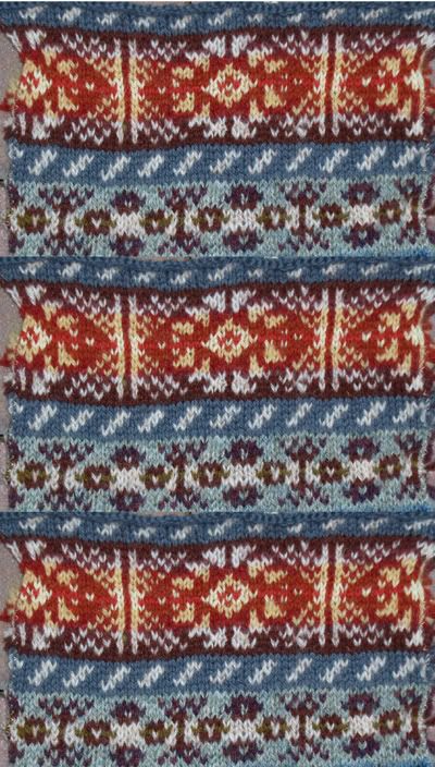
Ah the wonders of Photoshop! I was able to take the section of my swatch that I like and duplicate my repeats, rather that have to do a lot more knitting. I'm pretty pleased with it
I reversed the dark and light on the 15 row bands. When I did that, some of the colors no longer worked the way I wanted them to. When I started replacing some colors, others had to go.
Believe it or not, the background color in the peerie patterns is medium grey. It is a wee bit on the cool side looking at it in the ball. But look how blue it looks here. The amazing power of color to change and fool the eye.
10 comments:
That gray almost looks blue on this end. That is a really cool trick with photoshop!!!
I like this one more!
It seems like you can knit as fast as a person could PhotoShop.
Smashing, Elizabeth. Just smashing. You have such a talent with fair isle. And it is amazing how sometimes the colors you think would never "go" actually do when you put them together.
What a great idea to repeat the pattern in Photoshop. This is lovely. I like the grey/blue a lot!
I love it! Very creative use of Photoshop too.
Um...may I somehow arrange to just sit and watch you do fair isle some time? I promise to have clean hands, be quiet, and neither whimper nor sob while watching.
Your fan and neighbor, the Perpetual Knitter of Toques
{hah}
Isn't technology amazing? Your FI is absolutely stunning. I so love everything you design! :)
Nice! The grey does look blue, and I like it a lot.
can you wear a sweater that is photoshopped? I wish! it would save me a lot of knitting time.
I'm not sure what the peerie patterns are so I'm imagining both blues as grays. I'm impressed either way.
Post a Comment